Project Overview

Roles

Team
2 designers - Myself (UX-focused) & Melissa (Visual Design-focused)

My Role
- Led the end-to-end UX design process including interface layout, interaction flows, and usability principles
- Led the user research and usability testing process
- Designed wireframe prototypes with a focus on accessibility and task flow efficiency

Partner's Role
- Developed visual identity including color palette, iconography, and logo design
- Designed graphic design elements to enhance user experience through visual language
- Collaborated on applying visual design elements to UX design structure
Problem Statement
College students often struggle with cooking healthy meals for themselves. Limited time, tight budgets, and lack of culinary knowledge make meal planning a frustrating experience. Many find it difficult to consistently prepare nutritious food, which can impact their physical well-being and ability to maintain a sustainable lifestyle. As students ourselves, we’ve experienced how challenging it can be to transition into independent living without the right tools and guidance.
Solution
We designed Pantry Pal, a mobile app tailored to help college students build confidence and consistency in the kitchen. Pantry Pal provides easy-to-follow, personalized recipes based on dietary preferences, ingredient availability, and budget. It also includes a built-in grocery list generator that organizes ingredients by recipe, making shopping faster and more cost-effective. The app empowers users to discover new meals, shop smarter, and eat better without added stress.
Objective
Our goal with Pantry Pal is to create a user-centered solution that makes healthy eating more accessible, affordable, and enjoyable for college students. By offering personalized recipe suggestions and streamlined shopping tools, the app aims to support students in building sustainable cooking habits and fostering independence in their daily lives.
User Research

User Interviews
To gain insight into college students’ experiences with grocery shopping and healthy eating, we conducted interviews with five students. Each participant was asked ten questions focused on their current shopping routines and cooking habits.
Q1. How often do you go grocery shopping
Every 2-3 weeks
Every week
Once a week
2-3 times a month
2 times a week
Q2. How would you describe your grocery shopping experience?
Stressful (just being there), go into it with a list
Love grocery shopping but not at a big store because its stressful so goes to a smaller one
Boring and tedious
Sometimes hectic but usually sufficient
They actually find grocery shopping relaxing and enjoyable to wander through the isle
Q3. Do you always shop at
the same store every time?
Always at the same store, Kroger
Always at the same 2 stores
Almost always shops at Meijer
Mainly shops at Kroger, sometimes places like Costco and Trader Joes
Different store depending on needs
Q4. Typically, how many people do
you shop/cook for?
Just self
Just self
Typically self, and 2 people twice a week
Just self
2-4 people
Q5. Do you enjoy cooking for yourself/additional people?
Enjoys cooking, but it’s hard to portion for self, would be easier to cook for a bigger group of people
Yes, cooking is fun for them
Yes to an extent, sometimes don’t want to cook
Not usually
Personal meals are simple and easy so cooking for other people can bring more fun
Q6. Do you face any challenges when it comes to cooking meals? If so, what?
Yes-portion size, trying to figure out what to cook, cooking the same thing often, motivation
Tend to only eat one thing, variety is difficult
Doesn’t really know what to make so sticks to basics
Doesn’t enjoy cooking so will order out instead at times
Tends to overcook and burn food
Q7. What do you usually
do with your leftovers, if you have any?
Tries to save them for the next day, but usually ends up forgetting about them and throws them away
Store them and eat the next day
If it’s a few bites throw it out, but if it can be part of a meal later they save it
Depends, but will most likely not eat them.
Throw away
Q8. Is there anything that currently exists that you use to make shopping/cooking easier?
No, just the general internet
Google and Tiktok tutorials
Clicklist
Doordash
Doordash/Uber eats
Affinity Mapping
To make the interview findings more digestible, we synthesized and categorized key insights to inform our brainstorming process and ensure the core user issues remained central to our project direction

Comparative Analysis
While there are no direct competitors for our app concept, several existing products offer features that align with our vision. Our goal is to expand upon the ideas found in food delivery services and meal kit programs, while taking a different approach. Unlike these services, our app does not include a delivery component. Instead, it focuses on enhancing the in-store grocery shopping experience. By helping users create personalized meal plans and shopping lists, our app aims to reduce stress, promote healthier habits, and minimize food waste.

Sketches + Med-Fi
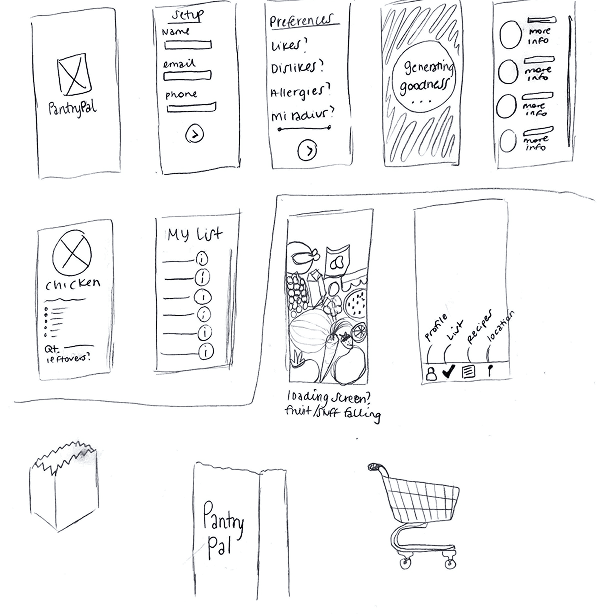
Sketches
To support our brainstorming process and begin visualizing potential solutions, we created simple sketches of possible screen layouts and sketched out a storyboard to illustrate the user flow

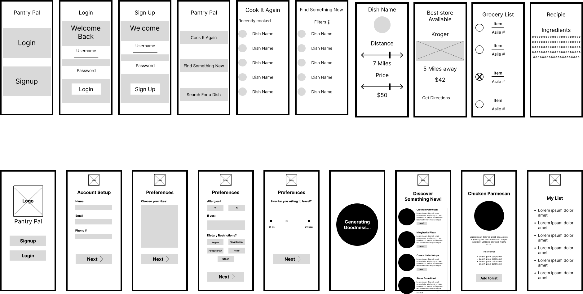
Med-Fi Wireframes
Our primary focus at this stage was ensuring that the screens followed a logical and sequential order, supporting a smooth and intuitive experience. During this phase, we also made key decisions about which features to prioritize. Given time constraints and the scope of prototyping, we chose to focus on the most essential functionalities. These included:
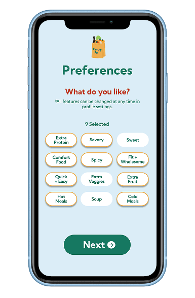
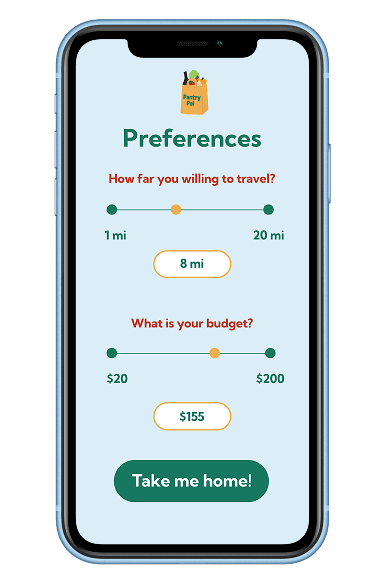
A detailed preferences setup
A personalized, auto-generated recipe list
A “Make Again” tab for saved favorites
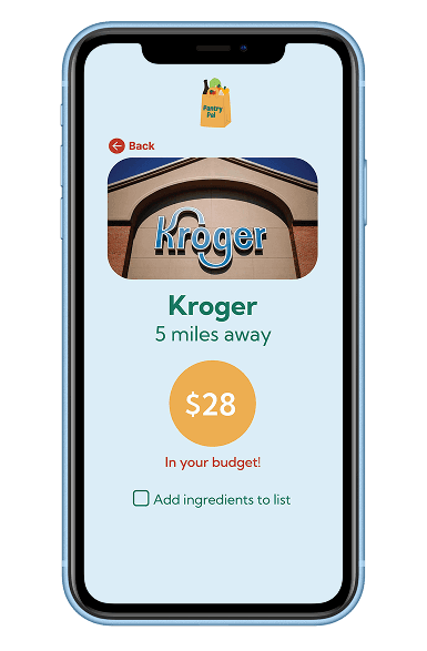
A dynamic grocery list feature
These features were selected to best support the app’s core goals while allowing us to move forward efficiently in the design process.
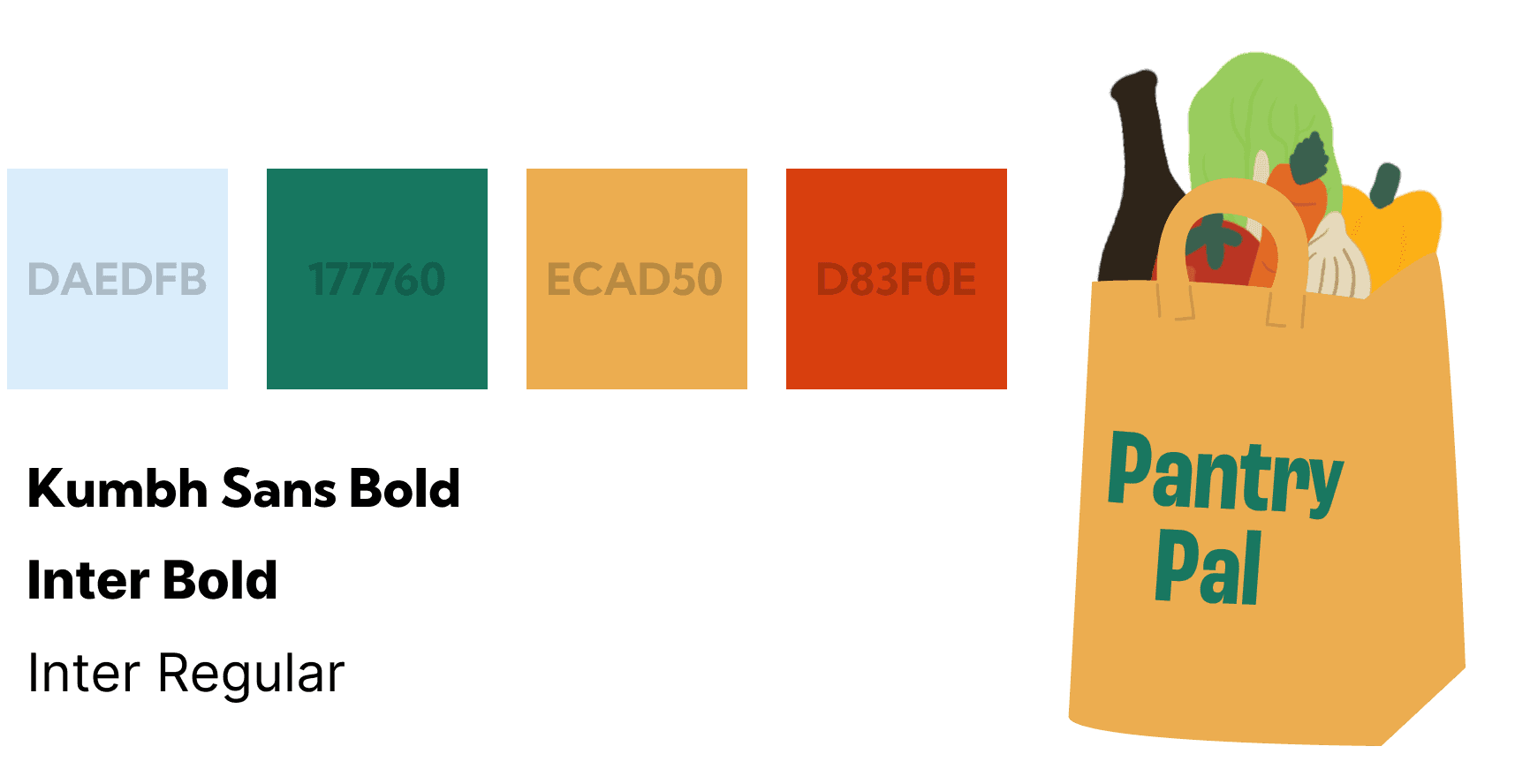
Style Guide
To support the transition from medium- to high-fidelity designs, we created a comprehensive style guide outlining our visual direction. This included our color scheme, font pairings, and main logo. The visual tone of Pantry Pal is playful and friendly, appealing primarily to young adults and college students—while still being approachable for a broader audience. We selected a light blue background for the core interface, paired with contrasting colors for typography and key design elements. To ensure inclusivity, all colors were tested against WCAG 2.0 accessibility standards for adequate contrast and readability.
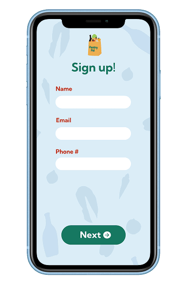
High-Fi Wireframe


Interactive Prototype
Usability Testing
We conducted two usability tests with college students to evaluate the clarity and functionality of our app’s interface. Each session focused on observing how users approached key tasks related to navigation and content discovery.
Tested Tasks:
Change Preferences – If you wanted to change your preferences, where would you go?
Access Shopping List – How do you get to your shopping list?
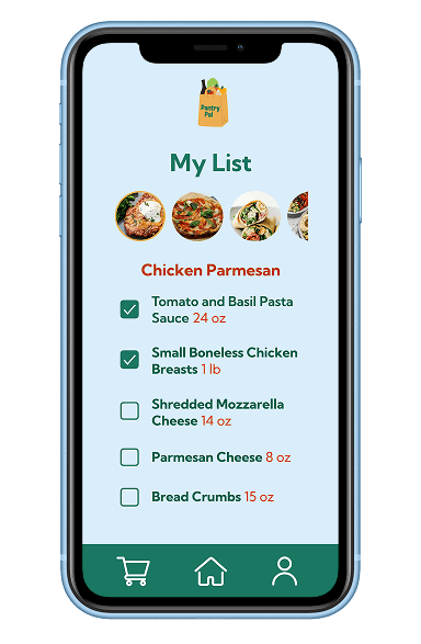
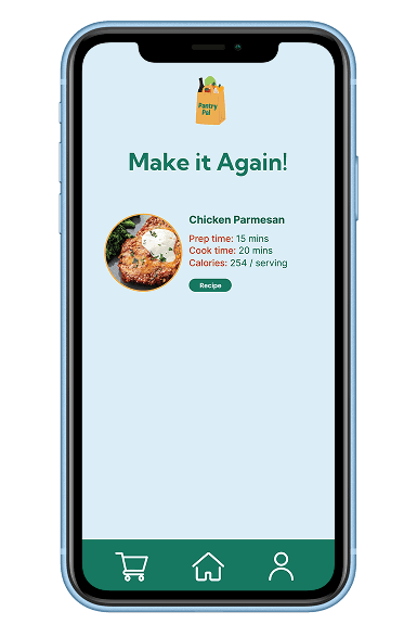
Return to Recipe – How do you go back to the recipe for Chicken Parmesan?
These tasks helped us assess the intuitiveness of the navigation system, icon clarity, and content hierarchy within the app.
Test #1
Actions Taken:
The participant clicked Sign Up, tried selecting options on the Preferences page (non-functional in prototype), explored the Discover tab, scrolled through recipes, opened a Recipe Page, and tapped the Shopping Cart icon.
Notable Quotes:
“Do I click login or signup?”
“Oh, I can’t actually click these.”
“How do I go back?”
“That’s cool I can scroll.”
“How do I continue? Oh, I have to click the box.”
Observed Feelings:
Confused, curious, slightly surprised
Opportunities Identified:
Make back navigation clearer
Remove or revise checkbox on Get Directions screen
Clarify which elements are interactive in testing environments
Test #2
Actions Taken:
The participant first clicked Login, then switched to Sign Up. They attempted to interact with the Preferences selection buttons, then navigated to the Discover tab and scrolled through the recipes. They selected the Chicken Parmesan recipe but did not scroll through it. After tapping More Info, they clicked the checkbox and proceeded with the Next Action button to view the shopping list. They also tried interacting with checkboxes there. The participant later revisited the Settings and clicked through that flow, tapped the Shopping Cart, and returned to the Home screen to change preferences.
Notable Quotes:
“I’d hit the shopping cart.”
“I’d go home first then Make Again.”
“It’s easy to navigate.”
Observed Feelings:
Curious, engaged, slightly surprised
Opportunities Identified:
Add or improve back button visibility and consistency
Make it more obvious that preferences can be changed in Profile Settings
Consider including the Home navigation bar on more screens
Results: Findings from our user testing revealed that improvements were needed in two key areas. First, back navigation was not always clear or consistent, leading to moments of confusion. Second, the purpose of the profile icon was unclear to some users, particularly in relation to accessing or changing preferences. These insights guided refinements to our navigation structure and icon clarity.
Next Steps